Difference between revisions of "AU User activity (logins)"
Bmullerova (talk | contribs) |
Bmullerova (talk | contribs) (→Charts) |
||
| (8 intermediate revisions by the same user not shown) | |||
| Line 15: | Line 15: | ||
'''Date Range''' | '''Date Range''' | ||
The date range is set up | The date range is set up to display data in the last 90 days by default, however the user can choose any date range they want by using the Date Range control box. | ||
[[File:Date Range control box.png]] | [[File:Date Range control box.png]] | ||
| Line 41: | Line 41: | ||
[[File:workstation.png]] | [[File:workstation.png]] | ||
== Charts == | |||
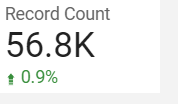
The Record Count control box placed in the upper right corner of each page shows the total number of logins and the percentage change compared to the previous period depending on the selected parameters. | |||
[[File:record count.png]] | |||
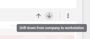
Users can hover over the top right corner of any chart and click on either the up arrow or the down arrow to see more or less detail. | |||
[[File:drill down.png]] | |||
The bar chart on the first page shows the total number of logins for each platform, users can go into more detail by setting up parameters and clicking on the down arrow button. | |||
[[File:platform chart.png]] | |||
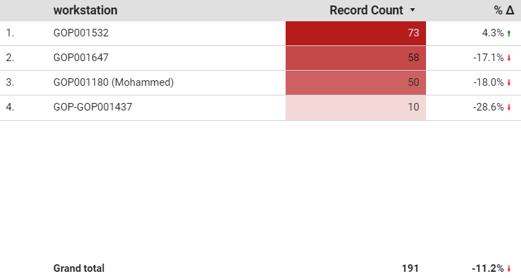
The table chart in the lower left corner shows the number of logins per platform/company/workstation in the Record Count column and the percentage change compared to the previous period in the %Δ column. The last row shows the same values as the Record Count control box placed in the upper right corner of each page. | |||
[[File:workstation chart.png]] | |||
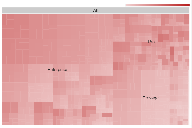
The tree map chart in the lower right corner shows ratios of each part to the whole. And again users can go into more detail by setting up parameters and clicking on the down arrow button. | |||
[[File:treemap.png]] | |||
The stacked area chart on each platform page shows the trend of logins of the top 10 companies. Users can click on the up arrow button to drill up and see the trend in less detail. The chart below drops the data into weeks, therefore there are major drops every approximately 5 days representing weekends. | |||
== Queries == | == Queries == | ||
| Line 50: | Line 71: | ||
The main query | The main query | ||
<code>SELECT product.platform, usertable.location AS workstation, usertable.`company`, `date`<br> | |||
FROM daily_installation_activity AS daily | FROM daily_installation_activity AS daily<br> | ||
JOIN usertable ON (usertable.product_code = daily.`productcode`) | JOIN usertable ON (usertable.product_code = daily.`productcode`)<br> | ||
JOIN product USING (productid) | JOIN product USING (productid)<br> | ||
ORDER BY `date`, company, platform, workstation; | ORDER BY `date`, company, platform, workstation;</code> <br> | ||
Later specified by using the where clause for each platform | Later specified by using the where clause for each platform | ||
For example: | |||
For example: <code>WHERE product.`platform` = "Enterprise";</code> <br> | |||
Latest revision as of 08:05, 19 July 2022
Is a dashboard created in Data Studio (internal link) that shows how many distinct users were active for a company on a chosen day/week/year and compares it to the previous period
How to use
Dashboard consists of 5 separate pages. The first page shows an overall view. The other 4 pages then go into more detail on each platform.
Parameters
Every page has a set of control boxes where users can select parameters. These parameters are date range, platform, company and workstation. First page has four parameters, while the other pages only have three parameters as each page goes into more detail on each platform.
Date Range
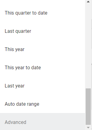
The date range is set up to display data in the last 90 days by default, however the user can choose any date range they want by using the Date Range control box.
There are two options, either choosing any date range offered by Data Studio or clicking on the “Advanced” option to customize the date range.
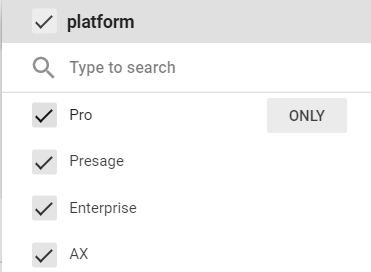
Platform
Users can either select one platform by clicking on the only button when hovering over one option or unselect one one or two to see the rest.
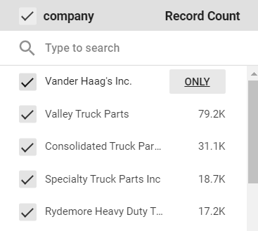
Company
Same as with the platform option.
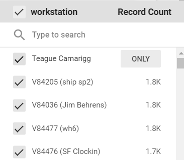
Workstation
Same as with platform and company options.
Charts
The Record Count control box placed in the upper right corner of each page shows the total number of logins and the percentage change compared to the previous period depending on the selected parameters.
Users can hover over the top right corner of any chart and click on either the up arrow or the down arrow to see more or less detail.
The bar chart on the first page shows the total number of logins for each platform, users can go into more detail by setting up parameters and clicking on the down arrow button.
The table chart in the lower left corner shows the number of logins per platform/company/workstation in the Record Count column and the percentage change compared to the previous period in the %Δ column. The last row shows the same values as the Record Count control box placed in the upper right corner of each page.
The tree map chart in the lower right corner shows ratios of each part to the whole. And again users can go into more detail by setting up parameters and clicking on the down arrow button.
The stacked area chart on each platform page shows the trend of logins of the top 10 companies. Users can click on the up arrow button to drill up and see the trend in less detail. The chart below drops the data into weeks, therefore there are major drops every approximately 5 days representing weekends.
Queries
Queries are written in SQLyog. The main query
SELECT product.platform, usertable.location AS workstation, usertable.`company`, `date`

FROM daily_installation_activity AS daily

JOIN usertable ON (usertable.product_code = daily.`productcode`)

JOIN product USING (productid)

ORDER BY `date`, company, platform, workstation;
Later specified by using the where clause for each platform
For example: WHERE product.`platform` = "Enterprise";

