ITrack/Control Types
In ITrack many different types of controls are employed to display information to the user and to get information from the user. This article enumerates the common control types a user might be required to interact with in ITrack.
Dialog
Dialogs are windows that exist outside of the main ITrack window that usually have more controls or data on them. They come in 2 general flavors:
Popup Dialog
Pop-up dialogs (also known as modal dialogs) are windows that present the user with information or choices that must be dealt with before the program can continue. Editing or defining a specific piece of information on a screen will sometimes be done inside of a pop-up dialog. Another common type of modal dialog is message boxes, in which the user is presented with a piece of information pertinent to the current situation, and are sometimes required to choose how to proceed.
Non-modal Dialog
Non-modal dialogs (often called floating dialogs or tool dialogs) are windows that exist outside of ITrack, but do not keep the user from interacting with the main program. For that reason, they usually present data that is parallel to what is being presented in the main ITrack window. An example of such a dialog is the picture viewer on the Enterprise search screen.
Button
Buttons are controls that are meant to be pressed (clicked) in order to execute a function or make a choice. When buttons have text, often times, a letter of their label will be underlined. If this is true, that letter is a 'hotkey' to that button. Therefore, hitting 'Alt + that letter' will press that button no matter where your focus is. In addition, if you move your focus to a button (by using your arrow keys, tab, shift tab (and enter on most screens)), you can simply press a letter key (or the spacebar) to press the button once its selected.
Buttons can sometimes be invalid when the user cannot interact with them. This could be because the object that the button is meant to operate on hasn't been loaded yet, or the user doesn't have permission. See below for an example of an invalid button.
Split Button
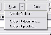
Split buttons (example pictured to the right) are a special type of button that serve two functions. The first function is essentially a regular button, and the second is a dropdown of options and more specific choices.
Hitting the button half of a split button usually executes the default function for the button (such as a normal save), and the dropdown (launched by hitting the black down arrow) will give the user access to advanced options and operations (such as "Save and Print" or "Save and Dont Close"). See example below.
Icon Button
| Icon buttons are buttons with no text that can only be identified by the icon they display. They operate exactly the same as normal buttons, except that they present the user with a iconic prompt instead of a text-based one. Therefore, any hotkeys associated with these buttons will be described in the manual or in the tooltip text for that button. |
Combo Box
| Combo boxes (also commonly referred to as dropdowns or dropdown boxes) are a type of control that presents the user with a discrete set of choices that they can choose from. Once a combo box is selected (by clicking on it or navigating with tab/arrow keys), the user can use the up/down arrows to choose the previous/next options in the combo, click on the black down arrow to see a list of all options, or type in the option they want. This third option to type in something not currently in the combo is only available in some combo boxes. A quick way to find the option you want is to hit the dropdown button and begin typing the option you want to choose, then hit enter to finalize the choice. |
Check Box
| Check boxes are simply controls with 2 states: checked, and unchecked. They are normally accompanied by a label lending context to the choice. If a character is underlined in the label, hitting 'alt + that letter' will check/uncheck the checkbox (similar to using hotkeys on buttons). Check boxes can be interacted with and toggled in many the same ways as buttons. |
Radio Button
Radio buttons (sometimes referred to as just 'radios') are similar to check boxes, except that they come in groups. Groups of radios are designed to give the user a choice between several different options or modes that can be toggled between. If one radio in the group is activated/checked (using the same methods, all other radios are automatically de-activated/unchecked.
List Control
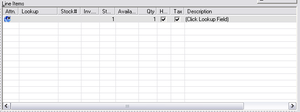
List Controls are one of the most flexible and powerful controls used in ITrack, and they are used extensively throughout the software to display large amounts of varied data. In addition to being able to display many records (rows) with many fields of data (columns), some list controls can be edited by the user. Other list controls are read only and are used to simply display data to the user in a useful manner. Below are some of the more important list control topics a user should know.
List Header
The bar at the top of a list control is called the header. In addition to showing the names of the columns, the header often has Tool Tips that describe the purpose of the column and the data displayed in it. The header of a sortable list control will appear differently, and clicking on it will sort the list. Also, the header can be used to reorder list columns and resizing list columns. Not all of these options are available on all lists in the software, but are usually available where appropriate.
Sorting List Controls
Many list controls can be sorted. Such lists can be identified by their header. Shown here are a version of a list control that is and isn't sortable.
As you can see, sortable lists have a deeper, more 3d look. In order to sort the items in a list, simply pick the column you would like to sort the items by, then click on that item in the list header. This will sort all items in the list by their value in that column. If you click that column again, it will reverse the sorting (ascending vs descending).
Reordering List Columns
Many list controls can have their column order changed. This can be done by simply dragging the columns with the mouse on the list header (Dragging is clicking with the left mouse button, and moving the item with the mouse button still depressed). Simply drag the column header to where you would like to see that column. Depending on your windows visualization settings, you should even see a preview of the item you're dragging as you move it. Many re-orderable lists in ITrack will even save their column order for each user so that the list will remember the user's last used column order.
Resizing List Columns
Almost all list controls in ITrack can have their columns resized. This allows the user to devote more screen space to some columns more than others. This can be done by dragging the vertical black lines that separate columns in the list header. Simply drag a column separator to resize the the column to the left of that separator. Many lists in ITrack will remember resizing information for the current user so that these changes will be remembered next time the user logs in.
If a column isn't wide enough to display the data in a cell, an elipsis (...) will be added to the end of the string to signify that there is more text. To quickly resize a list column to the minimum size required to fully display all cell data for that column, double click on the separator to the right of that column in the column header.
Static Text
Static text boxes (often referred to as 'statics') are simply read only text boxes on the screen. They can take several different forms, but are all generally used to give the user information or label other controls.
Static Frame
In the picture, the box with the word "Document" on it is a type of static called a static frame. They are usually used to group related controls together for the user's benefit.
Static Label
The text "Order #:" is a static of the most common type: a label. These statics lend context to other controls or user interface sections.
Static Data
The sunken box with the text "Not Yet Posted" is also a static (even though it looks like an edit box). This type of static is usually used to display dynamic information to the user, such as a subtotal or the ID of the currently loaded document. This type of control is read-only, but they can sometimes be clicked on for further user interaction.
Edit Box
Edit boxes (commonly referred to as just 'edits') are areas of user interaction where the user can type in values. Some edits have content regulations that make sure the content the user types in contains/doesn't contain certain values, is under a certain length, or has a certain precision (for numerical values).
There are some edit boxes (referred to as multi-line edits) that can support more than one line of text (see example above). In such edits, hitting enter starts a new line instead of going to the next control.
Drag Static
Drag statics are a special type of control that are designed to be dragged by the user with the mouse. They are usually used to allow the user to resize screen space allocation. This can allow the user to allocate more or less screen space to a control or set of controls. They come in horizontal and vertical flavors.
Pictured below is a set of drag statics, one vertical and one horizontal (they appear as a double dotted line).
Spin Control
Spin controls (also called up/down arrows or left/right arrows) are double usage buttons that allow the user to 'page' through data or items. They are often used to allow the user to display subsequent pages of data when there is too much to display on one screen.


